Motivation
For the May 26 2020 R4DS Tidy Tuesday data set, I explored UpSet charts, which simplify visualizing overlap of large numbers of sets. Laura Ellis has a useful explanation of how Venn and Euler diagrams become unwieldy for intersections of greater than two sets.
I analyzed which ingredients, as well as combination of ingredients, are most common in U.S. cocktail drinks.
Source
The cocktail ingredients data is originally from the Mr. Boston Bartender's Guide via Kaggle.
library(tidyverse)
library(janitor)

cocktails_raw <- read_csv("https://raw.githubusercontent.com/rfordatascience/tidytuesday/master/data/2020/2020-05-26/boston_cocktails.csv")

cocktails_raw
## # A tibble: 3,643 x 6
## name category row_id ingredient_number ingredient measure
## <chr> <chr> <dbl> <dbl> <chr> <chr>
## 1 Gauguin Cocktail Classi… 1 1 Light Rum 2 oz
## 2 Gauguin Cocktail Classi… 1 2 Passion Fruit … 1 oz
## 3 Gauguin Cocktail Classi… 1 3 Lemon Juice 1 oz
## 4 Gauguin Cocktail Classi… 1 4 Lime Juice 1 oz
## 5 Fort Laude… Cocktail Classi… 2 1 Light Rum 1 1/2 …
## 6 Fort Laude… Cocktail Classi… 2 2 Sweet Vermouth 1/2 oz
## 7 Fort Laude… Cocktail Classi… 2 3 Juice of Orange 1/4 oz
## 8 Fort Laude… Cocktail Classi… 2 4 Juice of a Lime 1/4 oz
## 9 Apple Pie Cordials and Li… 3 1 Apple schnapps 3 oz
## 10 Apple Pie Cordials and Li… 3 2 Cinnamon schna… 1 oz
## # … with 3,633 more rowsExplore
The dataset containes 3,643 rows comprising 989 unique cocktail drinks ("names") with 569 unique ingredients. Each cocktail-ingredient combination is a separate record.
Ingredients and corresponding serving size for cocktails are listed in the Ingredient and Measure fields. The cocktails are grouped into 11 cocktail categories such as brandy, gin and rum.
library(skimr)

skim(cocktails_raw)| Name | cocktails_raw |
| Number of rows | 3643 |
| Number of columns | 6 |
| _______________________ | |
| Column type frequency: | |
| character | 4 |
| numeric | 2 |
| ________________________ | |
| Group variables | None |
Variable type: character
| skim_variable | n_missing | complete_rate | min | max | empty | n_unique | whitespace |
|---|---|---|---|---|---|---|---|
| name | 0 | 1 | 4 | 36 | 0 | 989 | 0 |
| category | 0 | 1 | 3 | 21 | 0 | 11 | 0 |
| ingredient | 0 | 1 | 3 | 95 | 0 | 569 | 0 |
| measure | 0 | 1 | 1 | 12 | 0 | 42 | 0 |
Variable type: numeric
| skim_variable | n_missing | complete_rate | mean | sd | p0 | p25 | p50 | p75 | p100 | hist |
|---|---|---|---|---|---|---|---|---|---|---|
| row_id | 0 | 1 | 505.10 | 284.40 | 1 | 264.5 | 502 | 753.5 | 990 | ▇▇▇▇▇ |
| ingredient_number | 0 | 1 | 2.55 | 1.32 | 1 | 1.0 | 2 | 3.0 | 6 | ▇▃▂▁▁ |
Transform
Similar ingredients with different spellings can be consolidated.
tabyl(cocktails_raw, ingredient) %>%
  arrange(-percent) %>%
  head(20)
## ingredient n percent
## Gin 176 0.04831183
## Fresh lemon juice 138 0.03788087
## Simple Syrup 115 0.03156739
## Vodka 114 0.03129289
## Light Rum 113 0.03101839
## Dry Vermouth 107 0.02937140
## Fresh Lime Juice 107 0.02937140
## Triple Sec 107 0.02937140
## Powdered Sugar 90 0.02470491
## Grenadine 85 0.02333242
## Sweet Vermouth 83 0.02278342
## Brandy 80 0.02195992
## Lemon Juice 70 0.01921493
## Blanco tequila 69 0.01894043
## Egg White 67 0.01839144
## Angostura Bitters 63 0.01729344
## Juice of a Lemon 60 0.01646994
## Pineapple Juice 47 0.01290145
## Bourbon whiskey 38 0.01043096
## Orange Bitters 38 0.01043096cocktails <- cocktails_raw %>%
mutate(
ingredient = case_when(
ingredient == "Fresh lemon juice" ~ "Lemon Juice",
ingredient == "Juice of a Lemon" ~ "Lemon Juice",
ingredient == "Fresh Lime Juice" ~ "Lime Juice",
ingredient == "Juice of a Lime" ~ "Lime Juice",
ingredient == "Powdered Sugar" ~ "Simple Syrup",
ingredient == "Egg White" ~ "Egg",
ingredient == "Whole Egg" ~ "Egg",
ingredient == "Egg Yolk" ~ "Egg",
TRUE ~ ingredient
)
)
tabyl(cocktails, ingredient) %>%
arrange(-percent) %>%
head(20)## ingredient n percent
## Lemon Juice 268 0.073565743
## Simple Syrup 205 0.056272303
## Gin 176 0.048311831
## Lime Juice 153 0.041998353
## Egg 117 0.032116388
## Vodka 114 0.031292890
## Light Rum 113 0.031018391
## Dry Vermouth 107 0.029371397
## Triple Sec 107 0.029371397
## Grenadine 85 0.023332418
## Sweet Vermouth 83 0.022783420
## Brandy 80 0.021959923
## Blanco tequila 69 0.018940434
## Angostura Bitters 63 0.017293439
## Pineapple Juice 47 0.012901455
## Bourbon whiskey 38 0.010430963
## Orange Bitters 38 0.010430963
## Bitters 31 0.008509470
## Orange juice 31 0.008509470
## Old Mr. Boston Dry Gin 30 0.008234971Visualizing
An UpSet chart can be unwieldy with too many rows. I decided to limit to eight sets.
ingredients_top <- cocktails %>%
  count(ingredient, sort = T) %>%
  pull(ingredient) %>%
  head(8)
Option 1 - UpSetR package
The UpSetR package by Jack Conway seems to be most widely-referenced so started there. Installing via CRAN was a breeze.
First required step was transforming the raw data to a matrix format. Instructions were thorough but I struggled to convert, a large part because I am more familiar with the R tidyverse format. Ultimately I achieved through hacking other solutions. Ideas from Timothy Kyle Thomas (see here) and Kieran Healy (see here) were particulary helpful.
library(UpSetR)

cocktails_matrix <- cocktails %>%
  select(name, ingredient) %>%
  filter(ingredient %in% ingredients_top) %>%
  mutate(ingredient_population = TRUE) %>%
  pivot_wider(
    id_cols = name,
    names_from = ingredient,
    values_from = ingredient_population,
    values_fill = FALSE,
    values_fn = length
  ) %>%
  as.data.frame()

cocktails_matrix %>% head(5)
## name Light Rum Lemon Juice Lime Juice Simple Syrup Gin
## 1 Gauguin 1 1 1 0 0
## 2 Fort Lauderdale 1 0 1 0 0
## 3 Cuban Cocktail No. 1 1 0 1 1 0
## 4 John Collins 0 1 0 1 0
## 5 Cherry Rum 1 0 0 0 0
## Dry Vermouth Egg Vodka
## 1 0 0 0
## 2 0 0 0
## 3 0 0 0
## 4 0 0 0
## 5 0 0 0Once I had the data in the proper format, creating the charts was pleasingly straightforward in one function call.
The chart format was clean and easy to interpret. I could quickly see which ingredients (or combination of ingredients) were in the most drinks. For single ingredients, lemon juice led the way, followed by lime juice, vodka and gin. The most popular combinations of ingredients are gin with dry vermouth, lemon juice with simple syrup, then gin with lemon juice.
library (grid)

png(file="cocktails UpSetR.png") # or other device

upset(
  data = cocktails_matrix,
  order.by = c("freq"),
  nsets = 8, nintersects = 30
)
grid.text("Most Popular Cocktail Ingredients (using UpSetR package)",x = 0.65, y=0.95, gp=gpar(fontsize=10))

dev.off()
## quartz_off_screen
## 2Option 2 - ggupset package
The ggupset package by Constantin Ahlmann-Eltze is tidyverse-friendly so I immediately felt at home. Just a bit of transformation was needed into the tidy format - converting separate rows per ingredient into unique rows per cocktail.
library(ggupset)

cocktails_list <- cocktails %>%
  group_by(name) %>%
  filter(ingredient %in% ingredients_top) %>%
  summarize(ingredient = list(ingredient))

cocktails_list
## # A tibble: 733 x 2
## name ingredient
## <chr> <list>
## 1 19th Century <chr [1]>
## 2 Absinthe Special Cocktail <chr [1]>
## 3 Acapulco <chr [3]>
## 4 Adam and Eve <chr [2]>
## 5 Adderly Cocktail <chr [1]>
## 6 Admiral Perry <chr [1]>
## 7 Affinity Cocktail <chr [1]>
## 8 Affinity Cocktail (whisky) <chr [1]>
## 9 After Dinner Cocktail <chr [1]>
## 10 After Supper Cocktail <chr [1]>
## # … with 723 more rowsThe upset chart was created by simply adding one row with ggupset's scale_x_upset function.
The tidyverse-friendly package enables leveraging familiar ggplot2 constructs such as themes, labels and headers/captions.
ggplot(cocktails_list, aes(x = ingredient)) +
  geom_bar() +
  scale_x_upset(n_intersections = 30) +
  theme(
    plot.title = element_text(hjust = 0.5, vjust = 0, size = 14, face = "bold", margin = margin(0, 0, 15, 0)),
    plot.title.position = "plot",
    plot.subtitle = element_text(hjust = 0.5, vjust = 0, size = 6, margin = margin(0, 0, 2, 0)),
    plot.caption = element_text(hjust = 1, size = 8, face = "plain", margin = margin(15, 0, 0, 0)),
    plot.caption.position = "plot",
    axis.title.y = element_text(margin = margin(0, 10, 0, 0)),
    axis.text.x = element_blank(),
    axis.text.y = element_text(size = 7),
    axis.ticks.x = element_blank(),
    legend.position = "none"
  ) +
  labs(
    title = "Most popular cocktail ingredients",
    x = "Ingredient intersection",
    y = "# of drinks",
    caption = "Each column represents unique combinations of ingredients.  Universe is drinks in the Boston Bartender's Guide.\nVisualization: Joel Soroos @soroosj  |  Data: Mr. Boston Bartender's Guide via Kaggle via R4DS Tidy Tuesday"
  ) +
 ggsave("cocktails ggupset.png")
## Saving 7 x 5 in image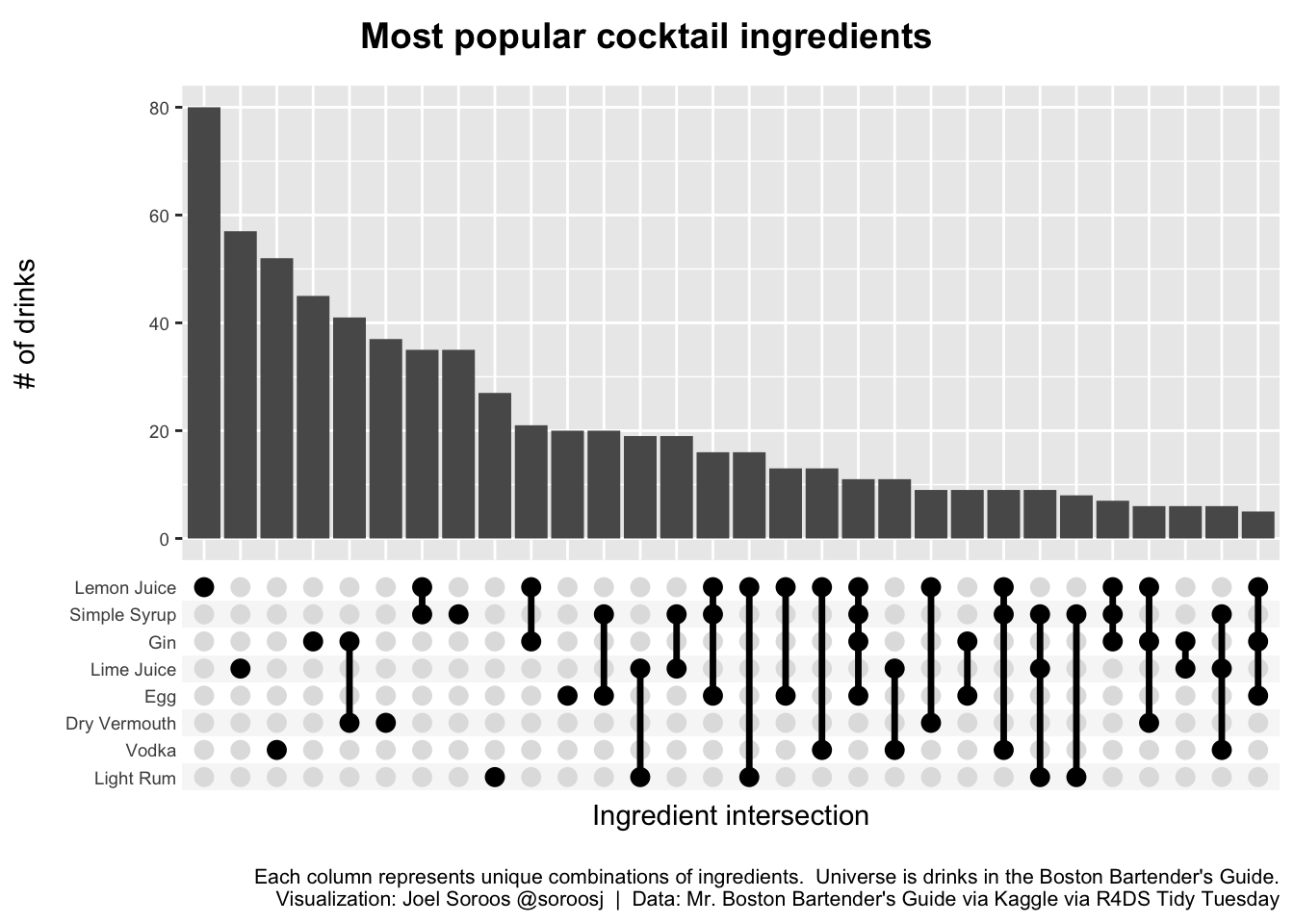
Conclusion
Due to my tidyverse background I ultimately preferred the ggupset format.
The ingredient counts at left were an advantage of the UpSetR package but not worth the incremental time contorting into the matrix format. Additionally, I much appreciated the ability to quickly add familiar ggplot2 themes, headers and captions.