In today's blog, I explore k-means clustering capabilities in R including algorithms, visualizations and methodologies to identify the optimal number of clusters ("k").
K-means clustering is an unsupervised machine learning tool to group similar unlabeled data or to identify patterns outside of existing categorizations in labelled data. K-means is the most widely used unsupervised machine learning tool and considered "unsupervised" due to absence of labelled data in the analysis.
All data is from the palmerpenguins package authored by Alison Hill and Kristen Gorman. The dataset was identifed via the weekly R4DS Tidy Tuesday community.
1. Source data
Data is sourced from the palmerpenguins package via its path_to_file function. I then converted to friendly file names using janitor::clean_names.
   library(tidyverse)
   library(janitor)
   library(palmerpenguins)
   library(knitr)

   penguins_raw <- read_csv(path_to_file("penguins_raw.csv")) %>%
      clean_names()

   opts_chunk$set(warning = FALSE, message = FALSE)
2. Exploratory Data Analysis
The dataset contains statistics on 344 penguins from the Palmer Archipelago near Palmer Station, Antarctica. 17 columns comprise statistics on size, clutch and blood isotope ratios, as well as categorical variables such as island, species and region.
The data is well-populated with minimal missing data. A minor gap is the sex variable (which is still 97% populated).
   library(skimr)

skim (penguins_raw)| Name | penguins_raw |
| Number of rows | 344 |
| Number of columns | 17 |
| _______________________ | |
| Column type frequency: | |
| character | 9 |
| Date | 1 |
| numeric | 7 |
| ________________________ | |
| Group variables | None |
Variable type: character
| skim_variable | n_missing | complete_rate | min | max | empty | n_unique | whitespace |
|---|---|---|---|---|---|---|---|
| study_name | 0 | 1.00 | 7 | 7 | 0 | 3 | 0 |
| species | 0 | 1.00 | 33 | 41 | 0 | 3 | 0 |
| region | 0 | 1.00 | 6 | 6 | 0 | 1 | 0 |
| island | 0 | 1.00 | 5 | 9 | 0 | 3 | 0 |
| stage | 0 | 1.00 | 18 | 18 | 0 | 1 | 0 |
| individual_id | 0 | 1.00 | 4 | 6 | 0 | 190 | 0 |
| clutch_completion | 0 | 1.00 | 2 | 3 | 0 | 2 | 0 |
| sex | 11 | 0.97 | 4 | 6 | 0 | 2 | 0 |
| comments | 290 | 0.16 | 18 | 68 | 0 | 10 | 0 |
Variable type: Date
| skim_variable | n_missing | complete_rate | min | max | median | n_unique |
|---|---|---|---|---|---|---|
| date_egg | 0 | 1 | 2007-11-09 | 2009-12-01 | 2008-11-09 | 50 |
Variable type: numeric
| skim_variable | n_missing | complete_rate | mean | sd | p0 | p25 | p50 | p75 | p100 | hist |
|---|---|---|---|---|---|---|---|---|---|---|
| sample_number | 0 | 1.00 | 63.15 | 40.43 | 1.00 | 29.00 | 58.00 | 95.25 | 152.00 | ▇▇▆▅▃ |
| culmen_length_mm | 2 | 0.99 | 43.92 | 5.46 | 32.10 | 39.23 | 44.45 | 48.50 | 59.60 | ▃▇▇▆▁ |
| culmen_depth_mm | 2 | 0.99 | 17.15 | 1.97 | 13.10 | 15.60 | 17.30 | 18.70 | 21.50 | ▅▅▇▇▂ |
| flipper_length_mm | 2 | 0.99 | 200.92 | 14.06 | 172.00 | 190.00 | 197.00 | 213.00 | 231.00 | ▂▇▃▅▂ |
| body_mass_g | 2 | 0.99 | 4201.75 | 801.95 | 2700.00 | 3550.00 | 4050.00 | 4750.00 | 6300.00 | ▃▇▆▃▂ |
| delta_15_n_o_oo | 14 | 0.96 | 8.73 | 0.55 | 7.63 | 8.30 | 8.65 | 9.17 | 10.03 | ▃▇▆▅▂ |
| delta_13_c_o_oo | 13 | 0.96 | -25.69 | 0.79 | -27.02 | -26.32 | -25.83 | -25.06 | -23.79 | ▆▇▅▅▂ |
GGally::ggpairs efficiently calculates summary statistics which is helpful to identify fields with high correlations that can potentially be removed from the analysis.
library (GGally)
ggpairs(
data = penguins_raw,
columns = c(10:14),
diag = list(continuous = wrap("barDiag", color = "blue", size =4)),
upper = list(continuous = wrap("cor", size = 4, bins = 60))
)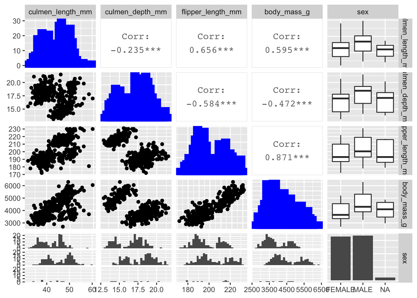 Body mass_g and flipper length_mm are highly positively correlated so I decided to remove body mass from the clustering algorithm.
3. Data wrangling
The existing field names are a bit technical and unwieldy. I renamed "culmen" as "bill" for clarity (assuming "bill" is clearer to most people) and removed units for brevity.
The dataset does not have a unique identifier. Accordingly I added a row ID because can be helpful when joining data sets.
I converted all units to standardized Z-scores because fields with larger absolute sizes can bias clustering results.
Finally, I removed the categorical variables because today's unsupervised machine learning analysis focuses on non-labelled data.
   penguins <- penguins_raw %>%
      rename (
         bill_length = culmen_length_mm,
         bill_depth = culmen_depth_mm,
         flipper_length = flipper_length_mm,
         body_mass = body_mass_g
         ) %>%
      mutate (
         id = row_number(),
         species = word (species, 1),
         bill_length = scale(bill_length),
         bill_depth = scale(bill_depth),
         flipper_length = scale(flipper_length)
         ) %>%
      select (id, species, island, sex, bill_length, bill_depth, flipper_length, body_mass) %>%
      drop_na (sex)
4. Principal component analysis
Large data sets can be difficult to visualize and require a larger sample size for statistical significance. Principal component analysis (PCA) is a feature extraction method that reduces the data set dimensionality (number of variables) by creating new uncorrelated variables while minimizing loss of information on the original vaiables. More detail here.
A Scree plot is a typical means to identify the appropriate number of dimensions (or factors) in a cluster analysis. The Scree plot visualizes the percentage of variance explained by each of the PCA dimensions (also known as eigenvectors). Factors that add minimal variance explanation can be removed.
For this analysis, the first two dimensions explain over 90% of the variance, with 66% by the first dimension alone. We can confidently focus the cluster analysis on two dimensions, which is significantly easily to visualize than the original three variables.
   library(factoextra)
   library(FactoMineR)

   penguins_PCA <-PCA(penguins[5:7], graph = F)
   fviz_screeplot(penguins_PCA)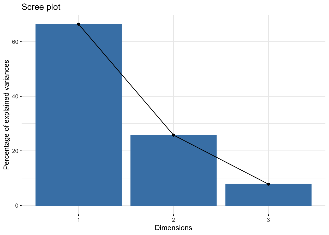
A loading plot, in turn, shows how strongly each of the original variables influences each of the new PCA dimensions. I have augmented the loading plot with a PCA score plot, which is a scatterplot of the data points with the PCA dimensions as X and Y axes. The combination of the loading and score plots is called a PCA biplot.
Bill depth and bill length both significantly drive dimensions 1 with bill depth positive and bill length negative. Both variables are postive contributors to dimension 2, although on a smaller scale than dimemsion 1 (hence the smaller percent variance explained for dimension 2).
The similarity of the angles in the loading plot indicates the correlation between the original variables. Angles between variables less than 90 are positively correlated, 90 degree angles are uncorrelated, while angles greater than 90 degress indicate negative correlation.
Flipper length is more correlated to bill length than bill depth.
   fviz_pca_biplot(penguins_PCA, geom = "point") +
      geom_point (alpha = 0.2)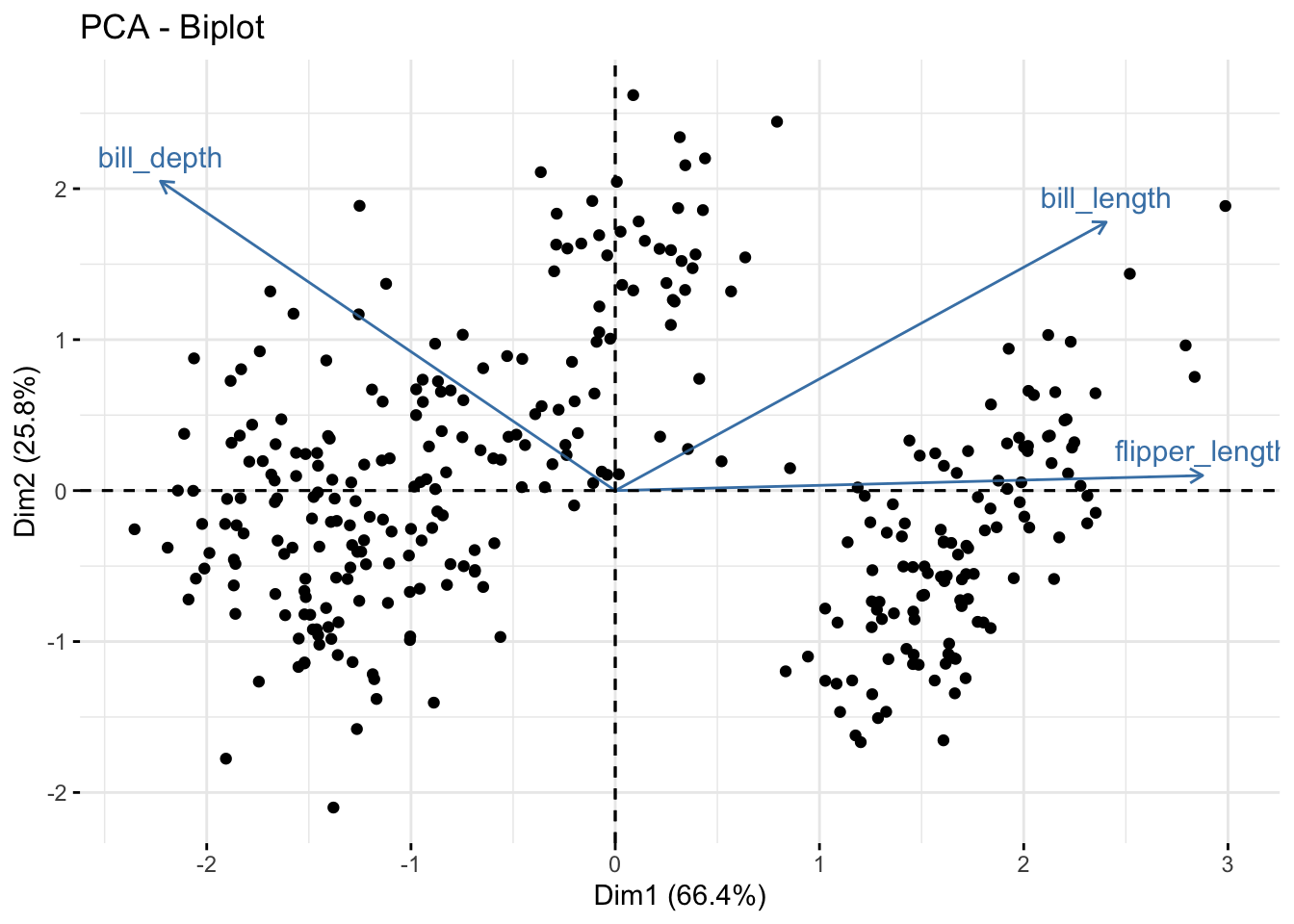
5. Identify optimal number of clusters
Kmeans clustering algorithms require number of clusters ("k") as an input.
Identifying the appropriate k is important because too many or too few clusters impedes viewing overall trends. Too many clusters can lead to over-fitting (which limits generalizations) while insufficient clusters limits insights into commonality of groups.
There are assorted methodologies to identify the approriate k. Tests range from blunt visual inspections to robust algorithms. The optimal number of clusterse is ultimately a subjective decision
Method 1 - Visual Inspection
The most blunt method is to visualize cluster data for assorted values of k.
I will be largely using the factoextra package by Alboukadel Kassambara and Fabian Mundt. The package contains a wide array of clustering algorithms and visualizations, along with tools to identify the optimal number of clusters. Particulary helpful is factoextra's clustering visualizations output in ggplot format, which simplifies further chart adjustments by leveraging the standard ggplot functions.
Fviz_cluster is a useful function to visualize clusters for a given k. The function creates a scatterplot with points in a cluster color-coordinated and encircled with a polygram. Clustering on greater than two fields is difficult to visualize so fields are helpfully automatically converted to two dimensions via principal component analysis (PCA).
Multiple fviz_cluster visualizations can be easily created in R. First, the factoextra::fviz_cluster function creates the chart for one K. Second, the functdional purrr:map creates charts for multiple instaces of K. Finally, patchwork::patchwork plots the resulting charts into a common visualization. A traditional starting point for k values is 1 to 9.
library(patchwork)
library(glue)
library(here)
kmeans_flex <- function (k) {
penguins_kmeans <- kmeans(penguins[5:7], k)
fviz_cluster(penguins_kmeans, geom = "point", data = penguins[5:7]) +
labs(title = glue("{k} clusters")) +
theme (
plot.background = element_blank(),
panel.background = element_blank(),plot.title = element_text (margin = margin(0,0,5,0), hjust = 0.5, size = 12, color = "grey", family = "Lato"),
legend.text = element_text(hjust = 0, size = 8, family = "Lato"),
legend.position = "none",
legend.title = element_text(size = 8),
axis.title = element_text (size = 8),
axis.text = element_text (size = 8)
)
}
cluster_possibles <- map (1:9, kmeans_flex)
cluster_possibles[[1]] + cluster_possibles[[2]] + cluster_possibles[[3]] +
cluster_possibles[[4]] + cluster_possibles[[5]] + cluster_possibles[[6]] +
cluster_possibles[[7]] + cluster_possibles[[8]] + cluster_possibles[[9]] +
plot_annotation (
title = "Kmeans Clustering of Penguins across potential number of clusters \U0022k\U0022 ",
caption = "Visualization: Joel Soroos @soroosj | Data: R palmerpenguins package via R4DS Tidy Tuesday",
theme = theme (
plot.title = element_text(hjust = 0.5, vjust = 0.5, size = 14, face = "bold", margin = margin (0,0,20,0)),
plot.caption = element_text (hjust = 1, size = 7, margin = margin (15,0,0,0))
)
)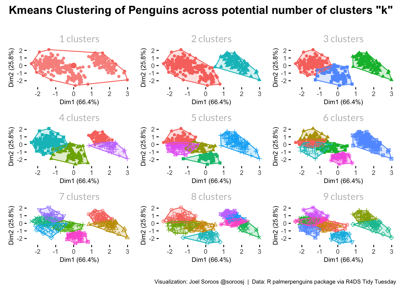 Results indicate a significant white space in middle of the chart so clearly a k of 1 is too small; therefore, clustering will add insight. Two or three clusters look promising as minimal overlap. Clusters greater than three have significant overlap so seem less optimal.
The visualizations did not provide a clear answer whether a cluster size of 2 or 3 is optimal. We need to proceed to more sophisticated methodologies.
The factoextra:fviz_nbclust function provides assorted methodologies to determine the optimal K. I calculated results for all three methodologies using another functional loop.
   methodologies <- c("wss", "silhouette", "gap_stat")

   cluster_optimal <- map (methodologies, ~fviz_nbclust (penguins[5:7], kmeans, method = .x))
Method 2 - Elbow
Optimal clusters are at the point in which the knee "bends" or in mathemetical terms when the marginal total within sum of squares ("wss") for an additional cluster begins to decrease at a linear rate. Similar to the visualization method, the results are subjective.
cluster_optimal[[1]]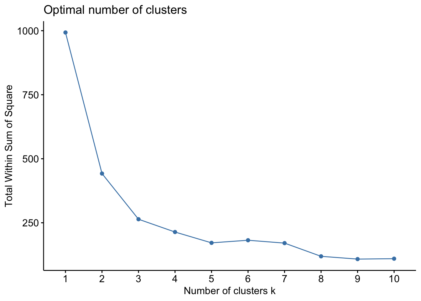 There are significant inflections at both 2 at 3 clusters. We can rule out an optimal number of clusters above 3 because minimal marginal reduction in total within sum of squares. However, the model is ambiguous on whether 2 or 3 clusters is optimal.
Method 3 - Silhouette
The silhouette value indicates the quality of the clustering. similarity of a data point to its own cluster compared to other clusters. A silhoutte width nearer to 1 indicates the point is well-matched to its cluster and poorly matched to neighboring clusters. Silhouette widths approaching -1 are better matched to neighboring clusters.
cluster_optimal[[2]]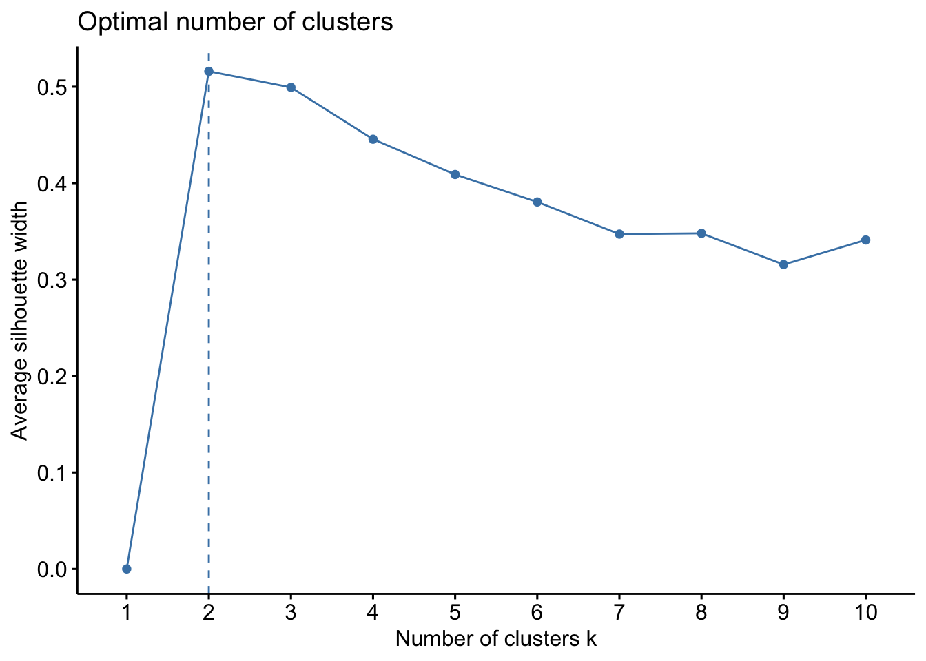 The average silhouette length begins to decrease after 2 clusters. Accordingly the recommendation here is k = 2.
Method 4 - Gap Statistic
The gap statistic test is a newer optimal K test by Robert Tisharni, Guenther Walther and Trevor Hastie. The methodology compares the total within intra-cluster variation ("WSS") for different values of k relative to a random uniform distribution of the data (that has no obvious clustering). The optimal cluster value of k has the largest gap statistic because signifies the cluster infrastructure furthest from the random uniform point distribution.
cluster_optimal[[3]]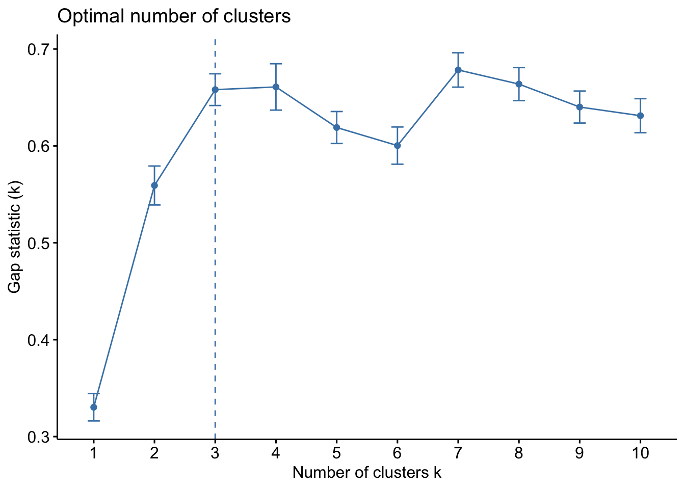 The gap statistic test calls for a cluster size (k) of 3.
Method 5: Multiple indexes
The NbClust package by Malika Charrad, Nadia Ghazzali and Azam Niknafs calculates the optimal K using 30 methodologies and aggregates into an index. The package equal-weightes each methodology and presents results in a histogram. The suggested optimal k is the k with the most optimizations across the 30 index methodologies.
   library (NbClust)

   cluster_30_indexes <- NbClust(data = penguins[5:7], distance = "euclidean", min.nc = 2, max.nc = 9, method = "complete", index ="all")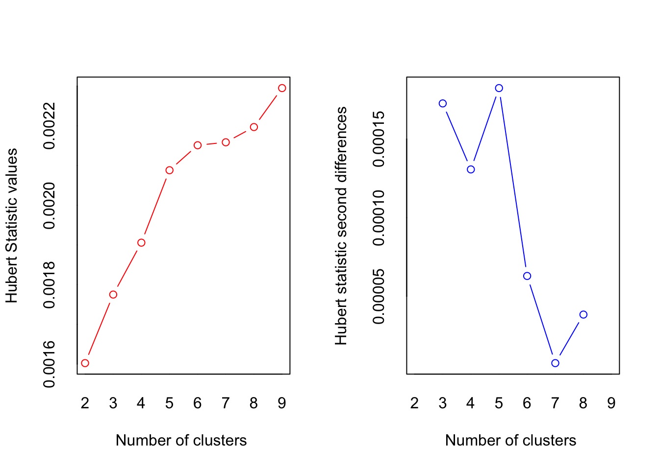
## *** : The Hubert index is a graphical method of determining the number of clusters.
##                 In the plot of Hubert index, we seek a significant knee that corresponds to a
##                 significant increase of the value of the measure i.e the significant peak in Hubert
##                 index second differences plot.
## 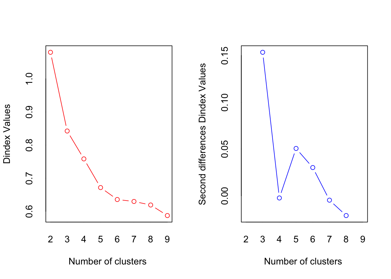
## *** : The D index is a graphical method of determining the number of clusters.
##                 In the plot of D index, we seek a significant knee (the significant peak in Dindex
##                 second differences plot) that corresponds to a significant increase of the value of
##                 the measure.
##
## *******************************************************************
## * Among all indices:
## * 2 proposed 2 as the best number of clusters
## * 16 proposed 3 as the best number of clusters
## * 1 proposed 4 as the best number of clusters
## * 2 proposed 6 as the best number of clusters
## * 1 proposed 8 as the best number of clusters
## * 1 proposed 9 as the best number of clusters
##
##                    ***** Conclusion *****
##
## * According to the majority rule, the best number of clusters is  3
##
##
## *******************************************************************
fviz_nbclust(cluster_30_indexes) +
theme_minimal() +
labs(title = "Frequency of Optimal Clusters using 30 indexes in NbClust Package")## Among all indices:
## ===================
## * 2 proposed 0 as the best number of clusters
## * 1 proposed 1 as the best number of clusters
## * 2 proposed 2 as the best number of clusters
## * 16 proposed 3 as the best number of clusters
## * 1 proposed 4 as the best number of clusters
## * 2 proposed 6 as the best number of clusters
## * 1 proposed 8 as the best number of clusters
## * 1 proposed 9 as the best number of clusters
##
## Conclusion
## =========================
## * According to the majority rule, the best number of clusters is 3 .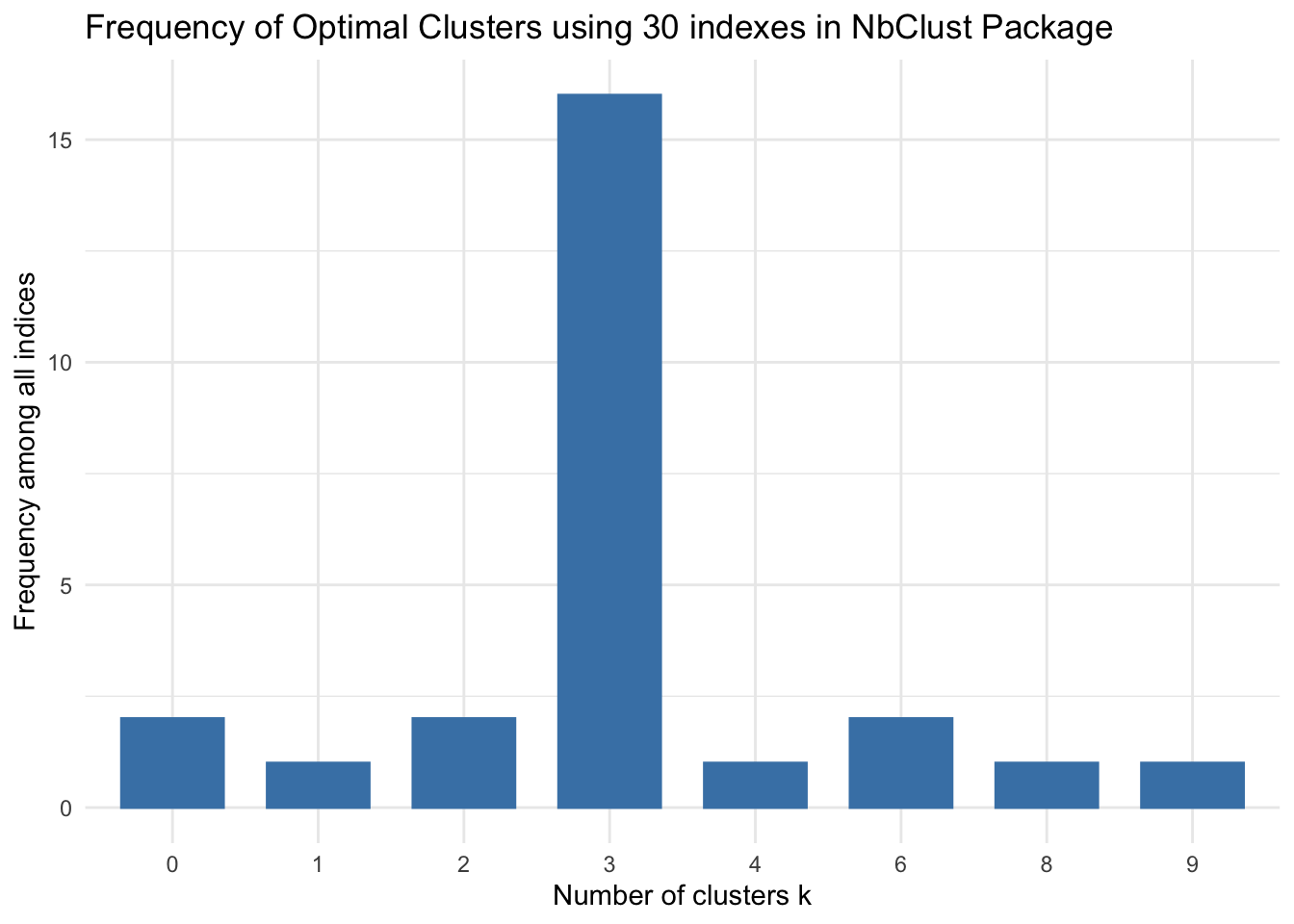 The 30 indexes seem to suggest 3 is the optimal number of clusters.
6. Conclusion
The kmeans study indicates penguin size is optimally grouped into 3 clusters. The blunt visual test inconclusively suggested 2 or 3 clusters. The quantitative tests were no more conclusive with three clusters recommmended by the elbow and gap statistic tests while two clusters by the silhoutte algorithm. The 30 index package tipped the results toward 3.